Five moments in snapping history
I had no idea finder could snap to file and folder name lengths!
This Is Not The Computer For You
A great look at the MacBook Neo and what it might inspire in those that use one.
If I hadn't started with Swift Playgrounds on my iPad mini then there's a good chance I wouldn't have launched 1 app, let alone 3.
Use what you have, try your best, be inspired and push whatever you have to it's limits. You'll be surprised with what you can achieve and what can be achieved.
Week 456: Spain win the 2026 World Cup
What I don't understand about the World Cup final yesterday is the Argentina have, probably, the best player to play the game and their entire approach in the last two games at least has been to bully the opposition.
Against England, they were awful. Against Spain they were even worse.
There was sweet justice in Enzo Fernandes being sent off and the Spain goal arriving of the back of a tiny lapse in concentration from Simeone.
We did not need 120 minutes of their nonsense. 90 minutes was too much. But Spain stuck to their plan, were disciplined and didn't fall for their tricks. They're world champions for a second time and deservedly so.
Week 455: Courting App Store feedback
If you've tried any of my apps that are currently in the App Store, it would be great to get some feedback. You can always send me a message on Bluesky or leave a review with some comments which I'll be able to see and reply too.
If you haven't tried any yet, then please do give them a go and let me know your thoughts. Waylist is a paid app, so if you'd like to get it for free I do have a very small number of promo codes I can share.
Waylist and Team Sheets both currently have 5 star ratings but with limited reviews so I'm looking to learn more about App Store distribution from that angle.
Week 454: Introducing Tixato, a twist on tic-tac-toe
About a year ago I came up with an idea for a game, it was a simple strategy game where you needed to take control of a board. I prototyped it and had it ready in a matter of hours. But the game play was became repetitive and predictably you would just fall into the pattern of either avoiding your appointment or you'd both counteract each other continuously.
Playing noughts and crosses (tic-tac-toe) with my son, I realised I could re-use the same mechanism to combine the two concepts and create a new strategy game based on tic-tac-toe and so Tixato was born.
Currently free, you'll find Tixato in the App Store. The price will increase come August but I'd love to get people playing and any feedback would be appreciated.
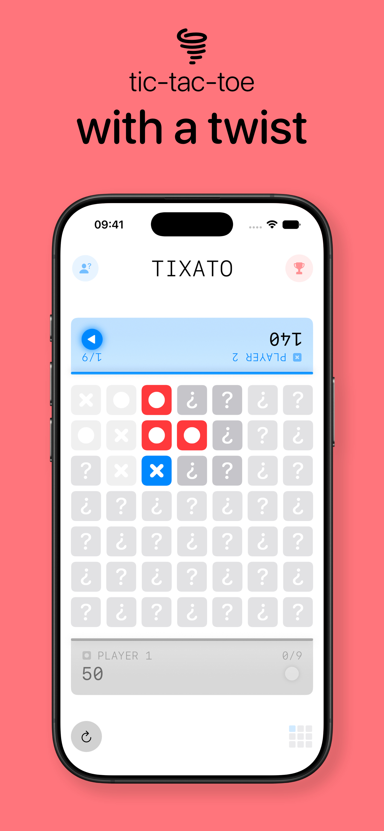
It's a game designed to be played in person, just place your device between two people and you can begin playing. It starts as a simply game of tic-tac-toe, but after the first grid, your next one is influenced by the last. As you move through, you'll find the centre grid might have been influenced by the previous 8 playable grids. First to 5 wins.
You can more details on the game play on the Tixato product page and I will be putting a product demo video together soon to really show of the simplicity and the strategy behind Tixato.
Week 453: Custom workouts in Apple Fitness
It took me a while to figure out that you could actually do it on your phone, because it wasn't obvious I managed to create one on my watch. Creating custom workouts might actually be a super power.
I'll share more soon, but having graduated the Couch to 5K program, I've found that the graduation programs crash half way through leaving me coachless. The Apple Fitness workouts aren't perfect, but because I'm using set distance goals, it's easy enough to see how much effort or time I have left.
Having disabled split notifications in the fitness app on the Apple Watch... I now need to figure out how to get them back which will stop me checking my watch constantly mid-run. It's a great way to check in and make sure it's all going smoothly.
Week 452: From overpowered to appropriately resources
It doesn't feel like it's been two years, but that's almost how long ago it was when I bought my MacBook Pro.
I ... went up a level with RAM. With Apple Intelligence, which may tax the RAM day-to-day, I thought it was best to get the most I could now as it can't be upgraded.
I made the right decision and with macOS Golden Gate around the corner, Siri AI is going to be RAM hungry I'm sure. Even Xcode on it's own demands a lot of resources and with more agentic features it's only going to want more.
Looking back, I'm sure I was trying to hit 36GB of RAM in my configuration but if I remember rightly, the step up from 24GB was 48GB which is where I settled. A great choice in hindsight.
RAM itself has become an expensive commodity and forced Apple to increases prices outside of an upgrade cycle. Looking at a SSD for myself, one I bought for less than £100 two years ago now costs twice as much but is only available in half the size. That's a 4x price increase per gigabyte.
I also work on a MacBook Air for my day job. It has 24GB of RAM is highly capable. Given I am not writing much code, you could argue it is overpowered. My own MacBook Pro is approaching the point of being appropriately resourced and so I am patting myself on the back for the decision I made in late 2024.
AI Economics for Dummies
Week 451: Top kits at the 2026 FIFA World Cup
Now that every team has played their first game at the World Cup, time to announce my favourites.
You can also look back at the 2022 and 2018 editions.
Overall, I'd say Adidas win with their kits and all my favourites are by the German supplier.
Curaçao
They may have been hammered by Germany in their first ever World Cup game, but their away kit is a thing of beauty. Adidas claim it's yellow but I'd say it's a deep beige.

I Could've Rickrolled the Entire FIFA World Cup.
Amazing story via kottke.org.
macOS Golden Gate Icon Comparison
Comprehensive for sure. Tahoe's icons look so washed out compared to the crispness of Golden Gate. Fantastic update across the board and I've already updated the icons for Waylist to take advantage of the new settings available in the Icon Composer beta.
Week 450: WWDC 26
Platform improvements look like they will give older devices in particular, a new lease of life. Improving speed launch times by 30% is no small feat for a device as old as the iPhone 11 (almost 7 years old). In fact there were over 200 improvements announced.
App Icons / Liquid Glass
In general, Liquid Glass looks more refined. Just trying the iOS 27 build in Xcode offers a clear improvement to the way it all looks on device. Clearer definition of elements and it does feel more polished in appearance.
App Icons specifically look crisper. That has been my biggest issue when creating Liquid Glass icons, they have soft edges that look too big. This evolution brings tighter edges and refractions with higher contrast. Both very welcome.
The move back to a consistent corner radii and fixing the sidebar and toolbars will go a long way to making Liquid Glass feel like the right move forward than it currently might for some. The sidebar in particular was poorly implemented and I look forward to some common sense coming back into the world of Apple's GUI.
What Now? World Cup, the pregame episode
Week 449: FIFA World Cup 2026
The World Cup is now days away, I had been collating images of the various kits to be worn at the World Cup to continue my tradition of posting my favourites. (See the 2018 and 2022 editions.)
After the tournament kicks off, I will post my favourite kits of 2026, but until then I wanted to pick out some teams I'll be rooting for. There are 48 to pick from and it would be rude to follow just one team so here's who I'll be following most closely.
Jony Ive Shows Me The Most Controversial Ferrari Ever (Ferrari Luce)
I've linked to 35:10 in this video where Jony Ive and Flavio Manzoni talk through the design around Ferrari's Luce. The next 4 minutes are a fantastic conversation around the task in hand when building an EV supercar versus a "regular" supercar.
I found it fascinating and feel like I should clip this and watch it often. If nothing else, I didn't realise there was effectively an exoskeleton around the Luce until I saw the animation around these points.
Also, the interior is just beautiful.
Week 448: Reading progress (May 2026)
After failing miserably at reading more, I've made a pretty good start to the year as I start reading my 7th book. I plan to write about the books I've read but I just wanted to mark my progress at this point. 6 books, both digital and physical, is no mean feat given one of my goals in 2024 was to read more. The reality was that I read just 3 books and then 3 more in 2025. I've already beaten the previous two years combined and hope to push on to double digits.
The mix of physical and digital has been good, but I have found bookmarking digital books to be hit and miss. Sometimes I return to a book and it's on the wrong page and I'm either re-reading entire pages or missing a chunk of content before realising.
I don't understand how the experience in both Apple Books and the Kindle apps are both so terrible.
Week 447: C25K Week 4
I've been sticking to a pretty good schedule but finished week 4 on a low.
This post is here to check in and say that it's possible to complete the challenges laid out to remind myself that I need to warm up before running.
3 minute runs are not much of a problem anymore, but the 5 minute intervals are tough.
Run 3 in week 4, I failed to warm up and suffered. Week 4 felt really intimidating but the first run was OK. The second run was not as good as my warm up was short but my third run I just forgot completely and then failed to complete the running intervals correctly.
I'll take a look at week 5 when I next think about heading out for a run but I might re-do one of the week 4 runs to give myself an achievable challenge before pushing on to the next round.
Taken
Apple Should Set and Enforce Some Basic Standards for Custom Video Players on tvOS
I'm actually not sure which apps on the Apple TV actually use the default timeline but you do find yourself putting up with the nonsense and the frustration that comes with them deviating from the standard.
Agree with John Gruber here, if your player doesn't match the default player then the app should be rejected. We're talking about million and billion-dollar corporations here, not indie developers.
View more posts in the archive or discover more notable items.