![]() Week 287 was posted by Charanjit Chana on 2023-04-24.
Week 287 was posted by Charanjit Chana on 2023-04-24.
I've come back around to thinking about the DOM structure for pages and am sat here wondering why it hasn't evolved and I think I had approached the problem the wrong way around the first time.
In fact, I would say I got it completely wrong...
I was looking at it from the perspective of going through the document and ending with an option to jump back. I really should have been looking at it as if websites were a bit more like books.
The homepage is probably OK as it is right now, it is the cover of your website and it would make sense to present links up front (table of contents in this analogy) so that your visitors are easily able to choose where it is they want to go. The rest of the pages should be treated more like chapters, a title followed by the content and an index at the end.
Is there an accessibility problem?
I am not an authority on the subject and I certainly need to spend more time with screen readers to get more informed. I've generally used best practice and, more recently, I've used Safari's reader mode to make sure articles are well structured.
To me at least, it continues to seem odd that we expect the accessible version of a website to ask someone to skip to the content. Why shouldn't the content come first? Content is King, after all.
What we do now
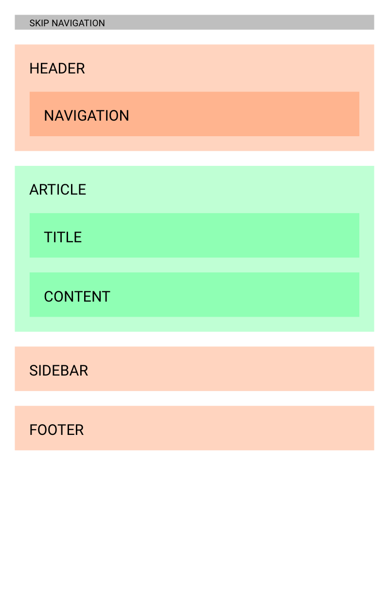
Currently, websites will often offer a 'skip to content' option as the first item on the page. Generally hidden from most, but a tab will reveal it and something that screen readers might announce. Using the link will take the user further down the page and skip certain bits of furniture on the page.
Here's an illustration of how the HTML is likely to be laid out:

What we should do
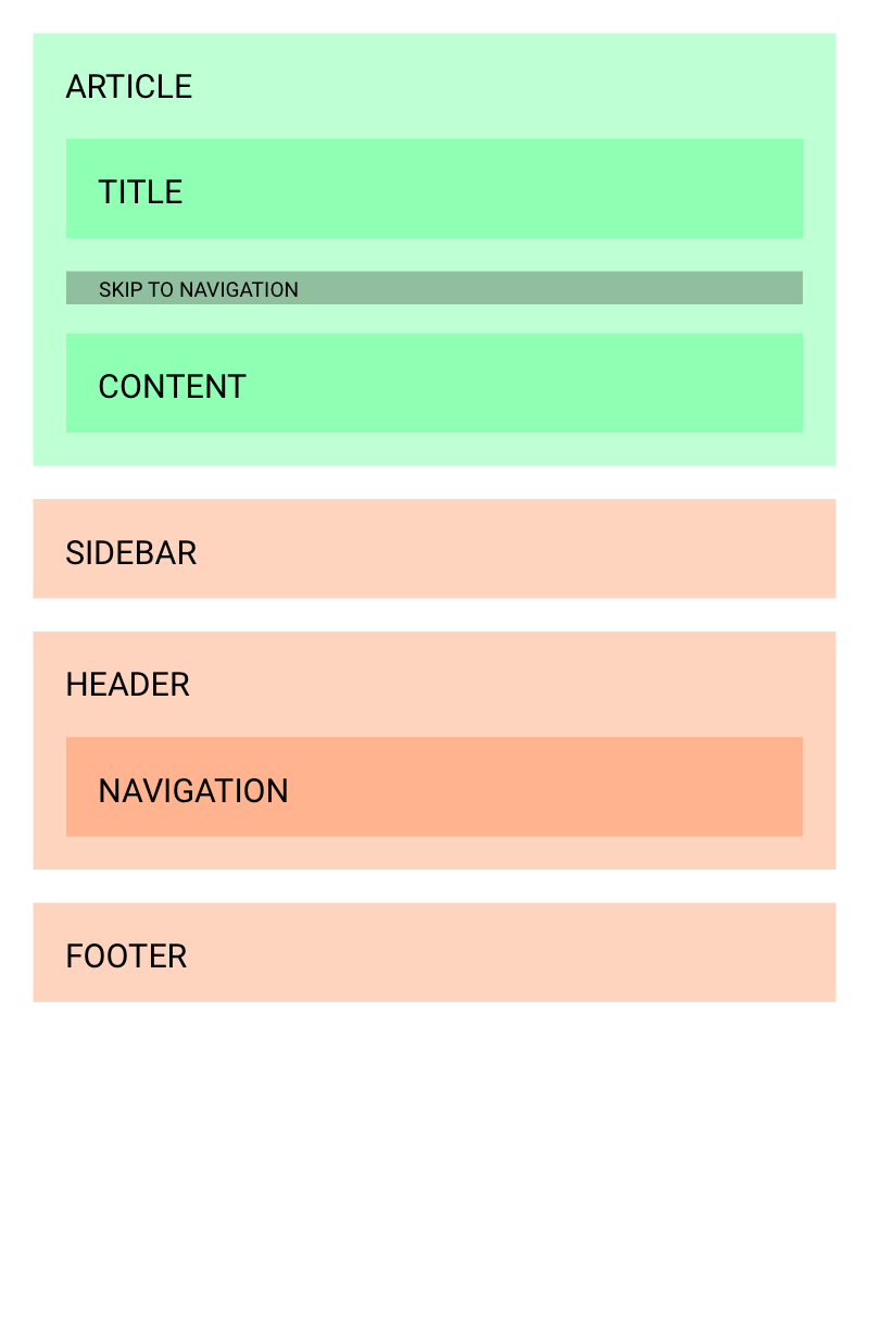
In my opinion, with content first, we should present the page title followed by the option to 'go to navigation'. As I said, the homepage may be structured the 'current' way, as it is the cover. But beyond that I'd expect the opposite to be more appropriate.
The markup model
While the homepage may well be as illustrated above, the follow structure is how it could be.

The rendered (and styled) DOM
Thanks to grid, flexbox and the order property, CSS can easily render this as we would want it. There's nothing that would make it impossible to make the header appear to be first in the structure even though it comes later in the page.
Using the book analogy we currently structure every page in this way:
- Header (and nav)
- Content (title, content)
- Footer
A user relying on accessible tools will always have to make the choice to skip to the content. Again, this makes plenty of sense on the homepage.
In my proposed new world, the user would get the page title read to them and then have the option to go to the navigation, but would be taken directly to the content as the default.
SkeletonCSS
I'll be adding an example to SkeletonCSS in the coming weeks to offer a default template with this structure as well as a homepage that has the current structure but works in the same way.
Tags: accessibility, css, html