![]() Week 358 was posted by Charanjit Chana on 2024-09-08.
Week 358 was posted by Charanjit Chana on 2024-09-08.
When Warrior took over as the kit manufacturer for Liverpool, they reintroduced the liver bird and L.F.C. to shirts rather than using the more formal club crest. A move I was fully behind, but outside of kits and training wear, the crest continued across print and digital media, and everywhere else.
This season, Liverpool have changed their approach to how the brand themselves and even the official website now has the liver bird in the header rather than the crest. It's far simpler and more fitting as a symbol of the club that is named after the city.
But I have some thoughts on the execution, which I think hasn't been great in all use cases. It feels like there should have been some variations that could be used for specific use cases.
Liver bird variations
On shirts, the liver bird and L.F.C. wordmark combination makes total sense. The liver bird alone would actually be fine but I can accept it sitting above the initials of the club. For comparison, Tottenham Hotspurs Football Club (THFC) do not include the name or initials on their kits or across any of their digital properties. Liverpool have kept the initials everywhere and that's where I think the variations are needed.
The liver bird is iconic enough to be the main part of the club's identity. These are the variations I would have made available:
- liver bird + L.F.C.:
- Football shirts
- Training wear
- Official printed products (eg: match day programmes)
- Digital content (eg: tickets)
- Official website header
- liver bird only:
- Social media profiles
- On screen graphics (live games and highlights)
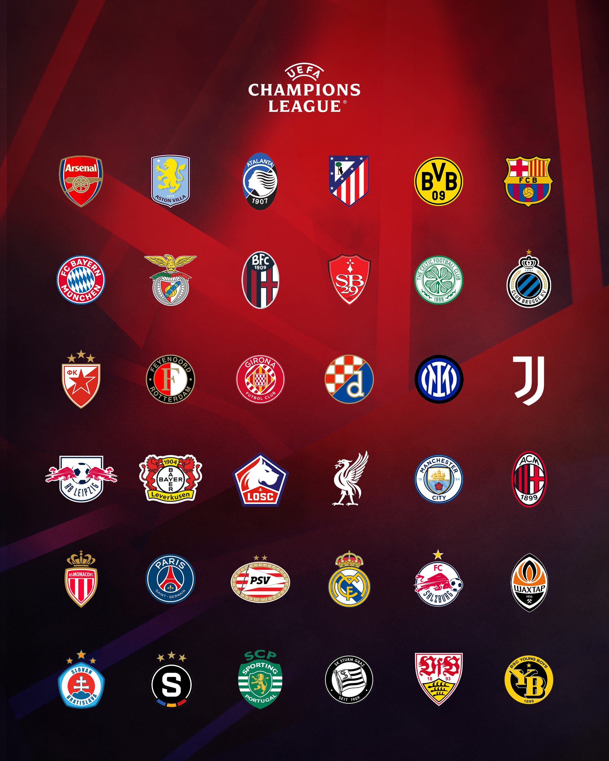
In a wider context, sometimes the liver bird doesn't fit quite right. UEFA's Champions League graphic has the new logo and the crest would be more in keeping with the rest of the badges here, but I think it's more that the initials throw it off because it minimises the iconic liver bird.

Here I've swapped it out for just the liver bird and it fits so much better.
Potential wider use
Anfield has grown in size massively since my first visit in 2008. It feels at least twice as high as it did back then and continues to have the club crest on the side. In 2008, the Kop had the full colour crest whereas now the stadium is adorned with silver crests which I think look better and more fitting with a club with such a rich history and so much success to celebrate. But what if it was just the liver bird?
LFC's Liver bird in the wild

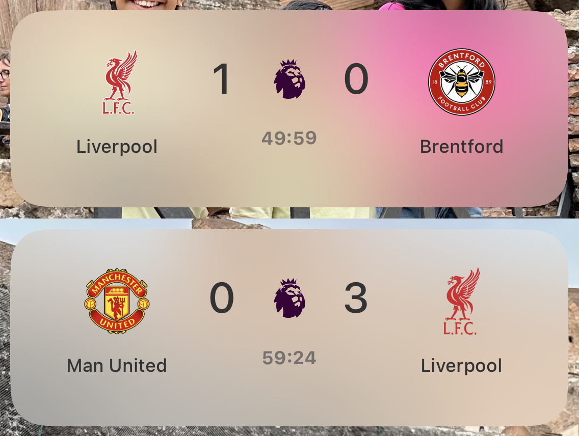
You can see above, against Brentford, that a white outline was applied but that seems to have been removed since. It looks far better without at least and at this scale, the initials work.

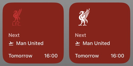
Above shows the actual Fotmob widget for iOS with the next fixture but the red badge on a red background looks silly. The initials look fine, but a larger liver bird would be better which I mocked up in white on the right.

Again I've mocked up at the bottom what the logo could look like if the initials were removed for Live Activities.
Final thoughts
I like it, but its use is complicated. There are so many sizes and use cases in the modern world to worry about. Ultimately I feel like the initials are overkill but understand why they're there.
Tags: branding, lfc, liverpool fc