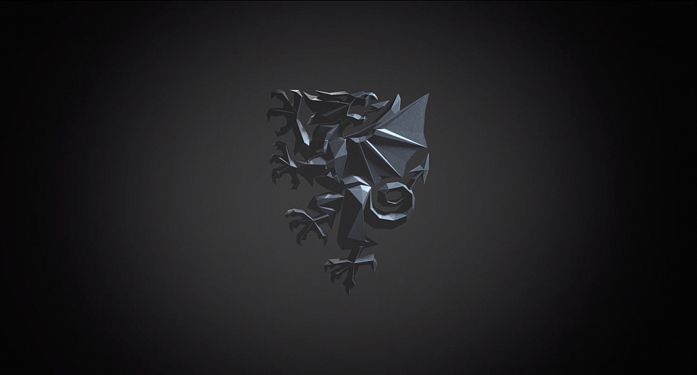
The chiselled dragon is so good, it's a shame that the overall shield design feels a bit... generic.

I'd have love to have seen just the dragon as the logo, more like how the Netherlands brand their jerseys, although they're technically in a shield too, it's just that the shield seems to match the colour of the garment most of the time.
| More notable items | |
|---|---|
| < Google Maps gains 'Live View' augmented reality walking directions | PlusMinus Screwdrivers > |